Mobile Websites vs. Responsive Websites: Which is Better?
Do you know what really bothers me? When people put the toilet paper roll on the handle facing the wrong way (can I please get an amen on this?). Kidding, but in all seriousness, I get really miffed when I’m looking for a phone number on a website that is not optimized for mobile, I find it, then have to highlight, copy and paste said number into my phone to dial it. I think to myself, “other websites have that neat little feature where I can just tap the 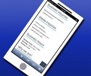 phone number and it automatically dials it for me.” Sigh. First world problems.
Have you ever wondered why some sites have that nifty little tap-and-dial feature and some don’t? Well, it’s because the ones that do have it possess what the technology world is now calling a responsive website – a website that uses the same URL on a desktop computer and a mobile device. A responsive site has the capability to adjust its settings depending on what device is being used to view the site. This lets the smart phone user do things like tap to dial a number or pull up a map from the website.
The other current design option is a mobile website, which is a site that has a totally separate URL from the desktop website that is specifically made for phone browsing. The mobile website is typically linked via a redirect code and is basically a smaller version of the desktop website.
Now, I know what you’re thinking. The responsive website is the obvious choice here since it lets a smart phone user do more. But, honestly, it depends on your needs as to whether to choose a responsive website or a mobile website. Here are a few tips to help guide you to the right choice for your business:
- Consider time – if you’re looking to create a website in a short amount of time, go with mobile design. It’s simple, so set up is much quicker.
- Consider expense – this plugs into the time equation above (you know, the whole “time is money” phrase), setting up a mobile website is less time consuming and easier to do, so it’s also less costly. If you have a limited budget but still want an online smart phone presence, the mobile website is probably a better choice.
- Consider how often you will update the website – if you have a desktop website that you update often, a responsive design is the way to go. The more complex system allows for easier updating on a regular basis.
- Consider optimization – a responsive website facilitates tracking, payment and advertising on your website, which also primes it for search engine optimization, no doubt leading to more visits.
- Consider your audience – who is visiting your website? What platform are they predominantly using? What is the main purpose of your website? These are all questions to ask yourself when deciding which option is best for you.
The biggest things to remember when choosing your website set up are that you want to keep your audience engaged and you want to give them a positive experience when browsing. If your website exists solely for quick information, go with the less-expensive mobile site. If your clientele typically needs to interact with your website, the responsive design might be a better investment.
Caralee Culpepper – Writer & Message Board Specialist