Coping with Website Redesign

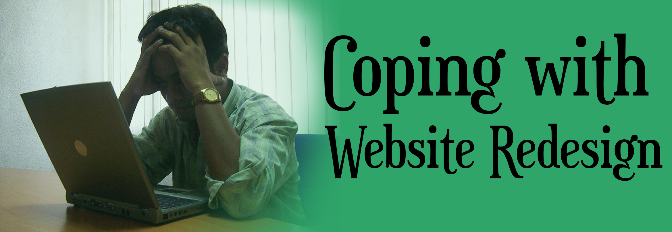
A good friend of mine recently revealed his disappointment for a website redesign, constantly justifying his discontent with, “I can’t find anything anymore.” This experience is far too familiar. Whether your email provider, news source, or favorite social network makes a change to their website, it initially seems like a terrible idea. There are two options: you can keep your frustrations to yourself and try to figure it out, or you can publicly complain. Surely the web designers will notice the outcry and fix their mistake.
Coping with Unfamiliarity
It was perfect the way it was; why did they have to change anything? As much as I also get frustrated by site changes and redesigns, the source of frustration isn’t necessarily because no one can find anything but because the interface is unfamiliar.
Despite initial frustration with the new design, keep in mind that the designers meant for this change to aid you. Before rising up in a big fuss about how much you hate the changes, give them some time to grow on you. Take a few minutes to learn how to browse this newly made over website. In time, the alterations will be replaced with familiarity. The former location of the search bar will soon be forgotten, and you might start to like this new design.
Let’s face it—as sites continue to evolve, changes are inevitable. Users aren’t thinking long term or anticipating strategic ways to enhance their web experience, and there will always be people uncomfortable with having to adjust their habits of where to click.
Helping Users Adjust
Due to the unfamiliar and inconvenience of adjustment, websites need to take advantage of maximizing the efficiency of the changes made. Make sure that the adjustments made are worth making and that it makes sense to users—changes should be logical and should, in the long run, be beneficial for both the user and the company. Otherwise, websites should reduce the potential unfamiliarity and inconvenience.
Managing an efficient redesign and looking out for your users go hand in hand, and looking out for users can be the distinguishing factor from poor web design to an efficient redesign with a few disgruntled users. And, above all, don’t forget the importance of content in a website redesign!
Taylor Crouch – Marketing Assistant


