Web Design for Higher Ed
 As a relatively recent college grad, it wasn’t long ago that I dedicated massive amounts of research to university websites. Especially at the beginning stage of my university career, when I faced the high-stakes decision of where to enroll, I gained a strong appreciation for well-designed websites with valuable content. After four years of post-secondary education in professional writing and a subsequent four years in the content marketing industry, I now devote much of my time at EVG to helping colleges and universities. Some of that time is devoted to higher education website design.
What does making better websites entail, particularly in the context of student recruitment? It means collaborating with EVG’s higher education team on audit, strategy, design and storytelling. It also means helping to solve one of the most pervasive problems the team encounters when evaluating websites: The fact that many university and college websites are often identical in format and design.
“Hey!” you might say. “That’s generalizing! Our site doesn’t look like everyone else’s.” Maybe you’re right. You could be one of the unique universities out there with a functional, useful, graphically attractive website. But this is hardly the status quo among web presence in higher ed.
Take a look at some examples. These websites have the same general look and feel.
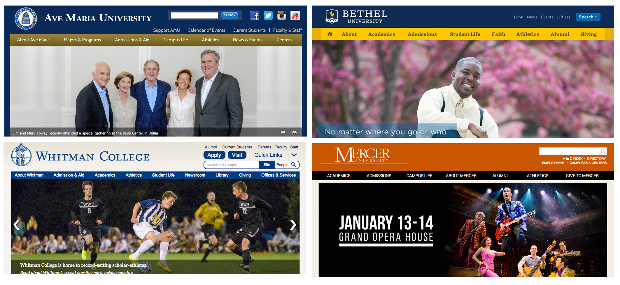 What are the distinguishing features? Logo. Color. Copy, to some extent.
What are the problems?
- The same (boring) fonts: Arial and Times
- The same menu block at the top and the same big image right underneath
- A lot of information crammed into a small space with ineffective organization, making it difficult and intimidating to navigate
- Not optimized for mobile
Just like a company’s website is an extension of its brick-and-mortar store, a university’s website is an extension of its physical location. All of your content, including and especially your website, should tell your university’s story. Web content is your chance to draw in potential students, current students, alumni and anyone just browsing. It is your chance to stand out among the crowd and to demonstrate why someone should choose you over all the hundreds of other options they have.
Your website is a storytelling tool. Your selling points need to be loud and clear—they should drive copy and design and pull your user in. Some of the following examples do this really well; others try hard and some just don’t do it at all.
Gettin’ It
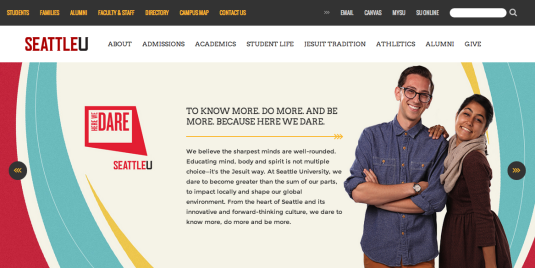
First and foremost, Seattle University’s website is really nice to look at. In an age of distraction, this is a critical advantage. Pleasing imagery and colors, stylish yet readable fonts (that aren’t Arial or Times New Roman) and just the right balance of negative space create a pleasing harmony. It helps that the content is top notch, too. I enjoyed scrolling through Seattle U’s page and reading about them—in fact, I’m curious. A lot of this site’s copy focuses on Jesuit tradition, and they smoothly incorporate this information without hitting me upside the face with it.
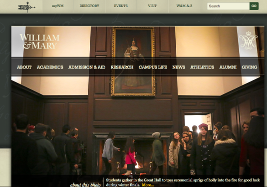
Like Seattle U’s site, William & Mary’s has great content, solid fonts, beautiful colors and a clean layout. It’s easy to navigate and, if you scroll down the homepage, there is a wealth of neatly organized information available. William & Mary is a historical college (the second-oldest in the nation), and they capitalize on that history while incorporating a sharp, modern edge that works.
Look at the image on William & Mary’s landing page: “Students gather in the Great Hall to toss ceremonial sprigs of holly into the fire for good luck during winter finals.” A fun, storied tradition that I can share with fellow classmates? I’d like to be a part! The About page alone intrigues me. This institution is superior without being pretentious, and I find it appealing.
Trying Really Hard
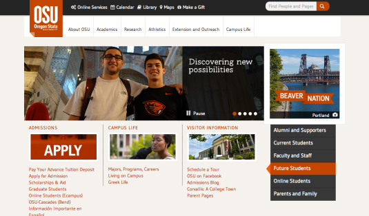
Oregon State University’s website is exceptional. Distinctive but eye-pleasing colors as well as easy-to-read typeface complement finely honed content. To be fair, the site doesn’t necessarily “make a splash.” However, it defies the norm with an effective blend of form and function. That said, some of the copy is long-winded, and a brief scan (which is, honestly, all most prospective students are going to devote to a university website as they begin to pare down the intimidating list) doesn’t quite tell the institution’s story. So, I’d put OSU on the “trying hard” list.
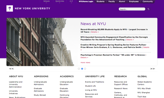
New York University’s website is simplicity at its best. There isn’t much to the design except for the rotating banner and a list of easy-to-navigate categorized links.
However, this site throws a lot of information at you, and the density makes it overwhelming. (Take a look at the About page, for example.) Where do I start? What do I read first? Do I just skim a bit here and then look there? To be frank: Why should I bother?
The ‘90s Attack
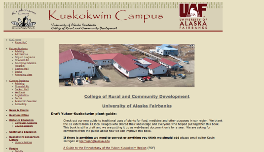
University of Alaska Fairbanks—Kuskokwim Campus
Though this is not the actual university website (which you can see here) but a campus website instead, that doesn’t make their web design choices any better. If anything, their website should have the same theme, colors and layout as the main campus site. The UAF logo is there, but it’s a different color on the campus site than on the main site—similarities end there.
The Kuskokwim Campus is in Papyrus font, which is outdated. The rest of the website looks like a theme from ten years ago, with a very large sidebar menu that is a static (and not very pretty) image. The university campus actually seems pretty cool (if you read the About page, you’ll see that they’re located in an area that holds one of the last indigenous cultures and societies resident in their homeland). However, the website doesn’t give that impression, and the copy is stiff and stilted. Even if they are straying from the main university’s look and feel, it could have been done much more simply and with more congruence.
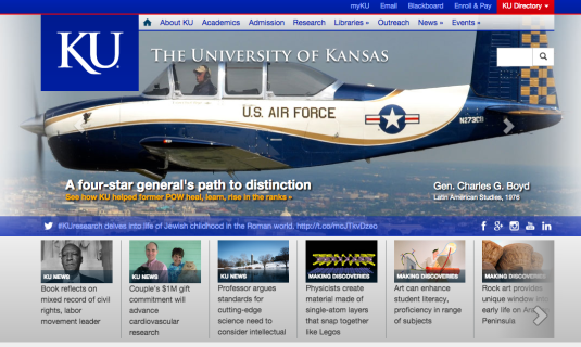
Kansas University’s website looks like a presidential campaign. The blue, red and gray are boring and stark, and the consistent use of Arial doesn’t help much. There is far too much text all at once—not conducive to browsing and sure to increase the bounce rate of your targeted millennial audience.
I didn’t get any sense of an overarching purpose from this site. In a word: boring.
So, as a university, how do you make your website a winner? How do you attract new students in the digital age, keep them coming to your website and ultimately spur them to enroll?
It’s easier than you think. Tell your institution’s story. Allow your selling point to drive design. Research the best-designed college websites and see for yourself why they’re so great. It’s not just about design and overall appearance; it’s also about navigation.
Remember: form and function. If you want a site that works—i.e., makes students chose YOU instead of your competitor—you simply can’t have one without the other.
Still stuck? EVG is here to help.
If you enjoyed this post, read more about higher education.
Vanessa Levin-Pompetzki – Digital Media Coordinator

